

Loading
Correct design of mobile application and
website gives you the following values


Increasing User Engagement.

An Intuitive User Interface.

Increase your conversion rate.

Improve your bounce rate

Buyer persona definition based on your target audience.

User satisfaction.
After our UI and UX audit, you know if mobile app or website redesign is required.
Check HowTake a look at our examples
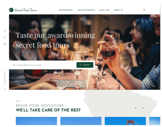
Website navigation
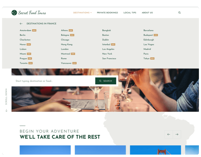
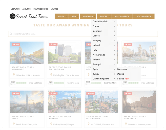
Website navigation
- Our Solution
- Issue
We studied pages on the website, grouped them into categories and added
to the top navigation.
The header on the homepage and other pages of the website might seem
confusing to a user because it is not consistent.
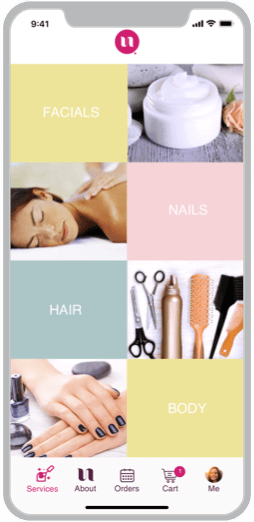
Product
Card
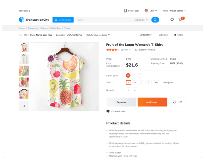
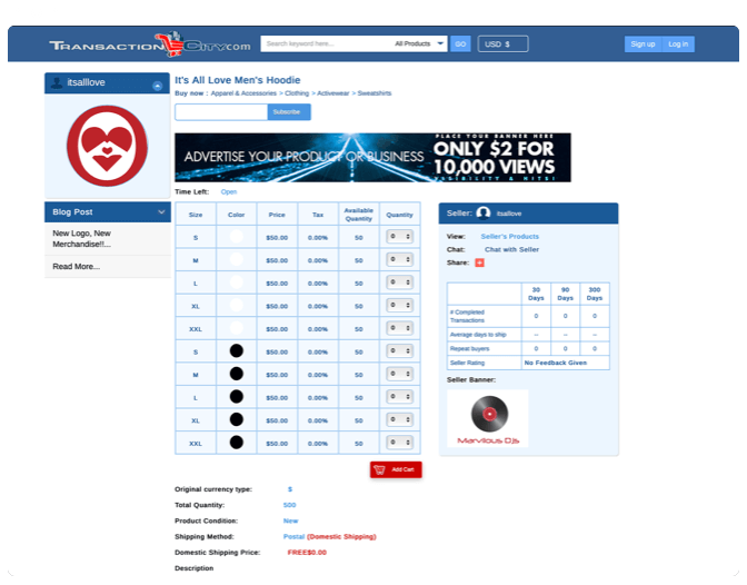
Product
Card
- Our Solution
- Issue
The page structure should be changed to bring the most important things
into a user’s focus of attention. So, the product information should be
placed at the top of the page, while less significant details should be put further
down the page. Banner ads should be removed from the page.
The current product page design shows a banner for a seller while a
product’s
picture can be viewed only upon scrolling down the page.
Apart from that, the blocks about the seller drive a user’s attention
away from the product.
Visual web design

Visual web design
- Our Solution
- Issue
We suggest a different approach to the homepage design to solve this
major problem. We’ve added a video to the background of the page, reorganized
tours making a user’s location the basic choice criterion and divided
tours into New and Top.
A simple homepage is composed of multiple cards, displaying cities of
the world, search field and the menu. The current design doesn't distinguish
between the primary and secondary cards. There’s no focus, so the page
doesn’t grab a viewer’s attention.
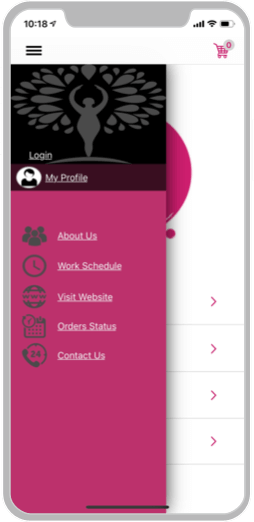
Information Architecture
Information Architecture
- Our Solution
- Issue
Since we have simplified the navigation and reorganized the menu
structure, there is no need to use the side menu at all. The tab navigation bar
always wins over the hamburger menu. In this case, all items are visible to a
user and accessible on any screen of the app, requiring no extra taps
from a user.
The app navigation doesn’t match the iOS Design Guidelines. When the
menu overlaps the home screen, it looks like the design that you’d typically
se on an Android device, not an iPhone.
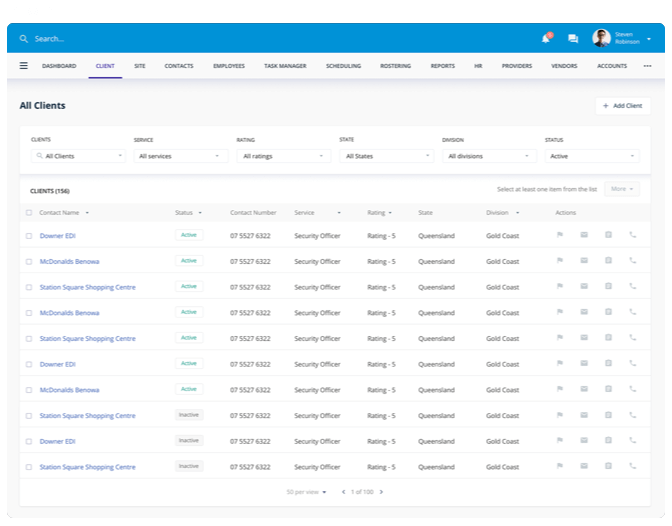
Data Visualization
Data Visualization
- Our Solution
- Issue
We have structured the table, so it provides the logical order of data
displayed. We have also expanded the menu to include more details, and
have facilitated the table’s format and design, so it offers more
information about the business.
With the following structure, the data table provides no informative
value to a business. Data display and navigation are structured and it’s not
convenient to fill out the table fields.
How it works
2 minutes
Answer our questions
3 business days
Design audit preparation
Priceless
Get PDF report in your inbox