

Scholé AI UX Audit: Playful Visuals for a Serious Platform
This is a short, self-directed teardown of Scholé AI — a publicly available product we picked ourselves, not a commissioned client audit.
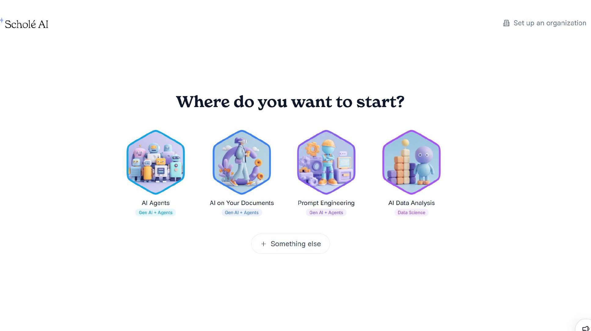
Scholé AI is a web-based AI-education platform: learners pick a track (AI Agents, AI on Your Documents, Prompt Engineering, AI Data Analysis) and work through gamified lessons guided by an animated mascot.
This review carries Onix’s own label, a “Brand Positioning & UX Audit,” resting on a single sentence from the report itself: “Aligning visual identity with a professional learning platform.” The two findings below follow the report’s own sequence.
Problem 01
The visual identity, heavy 3D cartoon mascots, playful illustrations, badge-like hexagon icons, reads closer to a casual consumer learning app than a professional AI education platform.
Why it matters
Positioning as a serious, credible school requires a look and feel that matches. The current tone undersells the platform’s actual substance and can make it harder to be taken seriously by professional or enterprise learners.
Improvement
Shift the visual language toward a more refined, editorial tone. Reduce cartoon illustration, adopt a more restrained color and iconography system consistent with professional education brands.
Business impact
- Stronger credibility with professional/enterprise audiences
- Visual identity that matches and reinforces the platform’s actual value
- More consistent brand impression across marketing and product
Problem 02
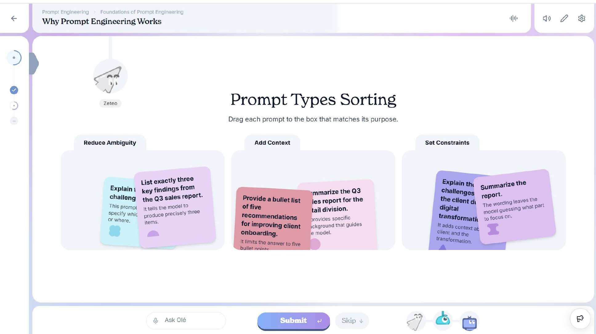
Gamified elements interfere with the learning task itself: card edges are visually bent/curled, reducing text legibility, and character mascots remain persistently visible during study rather than only at reward moments.
Why it matters
Decorative elements that compete with content during active learning increase cognitive load exactly when focus matters most, undermining comprehension rather than supporting motivation.
Improvement
Flatten card design for full readability, and limit mascot appearances to reward or milestone moments only, not during core study screens.
Business impact
- Improved comprehension and completion rates
- Learning experience that feels focused rather than distracting
- Gamification preserved where it adds value, removed where it doesn’t
Executive summary
Scholé AI has strong underlying content and a genuinely capable platform, but its current visual and interaction design leans more casual than the professional positioning it’s aiming for, and gamification has been prioritized ahead of personalization features that would more directly support learning outcomes.
Key opportunities
- Elevate the visual tone — Move toward a more refined, professional identity that matches the platform’s ambitions.
- Let content lead, not decoration — Keep gamified elements out of the way during active study.
Want this for your own product?
This is a short, self-directed teardown of a publicly available product. We picked Scholé AI ourselves to review — we weren't hired to audit it, and it isn't a client of ours. A commissioned UX audit goes further: it's scoped to your product's own goals and flows, not just what's visible to an outside visitor.
Want the same kind of review for your own product? See our website UX audit page for what's included, or browse more examples to see other teardowns.