

Thumbfa.st UX Audit: A Dashboard With No Clear First Step
This is a short, self-directed teardown of Thumbfa.st — a publicly available product we picked ourselves, not a commissioned client audit.
Thumbfa.st is a web AI YouTube-thumbnail generator with a dashboard, a Persons/Inspiration Styles library, credits, and a free trial.
Onix framed this one as a “Growth UX Audit,” built around a line the report itself used to state the problem: “Thumbfa.st has a strong AI thumbnail creation proposition, but the current experience introduces friction across three critical moments: onboarding, first creation, and understanding product access. These issues can make the product feel more complex and less predictable before users experience its core value.”
Problem 01
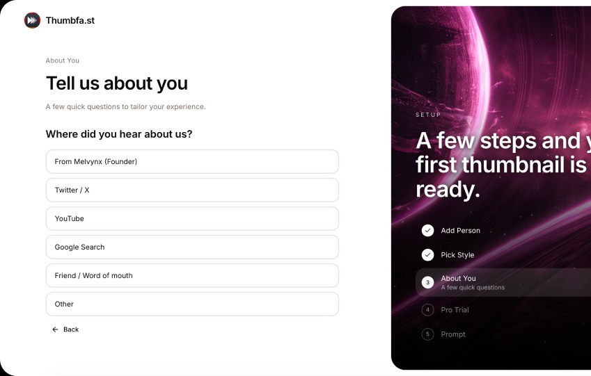
Before reaching the Dashboard, users are asked several questions about their role, publishing frequency, YouTube channel, and acquisition source, in addition to selecting a style and adding a person.
Why it matters
The user spends significant time providing information before seeing whether the product can actually create a useful thumbnail.
Improvement
Reduce the initial onboarding to information required for the first generation. Move research and personalization questions to a later stage, after the user has experienced the product.
Business impact
Additional steps increase the number of potential abandonment points before users reach the core value of the product.
Problem 02
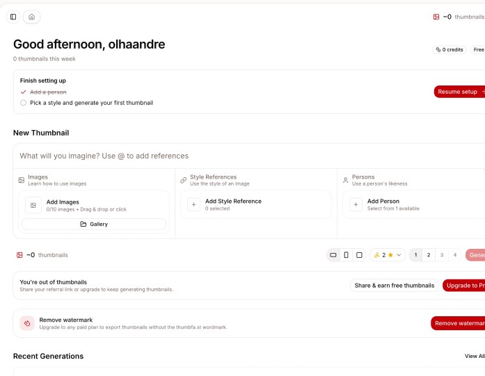
After onboarding, the Dashboard contains several sections — setup checklist, New Thumbnail, credits, watermark, recent generations, Persons and Inspiration Styles — but the primary path to creating the first thumbnail is not visually dominant.
Why it matters
A first-time user needs one clear answer: “What should I do now?” Instead, the screen presents multiple actions and status messages at the same time.
Improvement
Create a stronger first-use state around one primary CTA: Create your first thumbnail.
Business impact
Unclear prioritization can increase time-to-value and make first-time users less likely to complete their first generation.
Problem 03
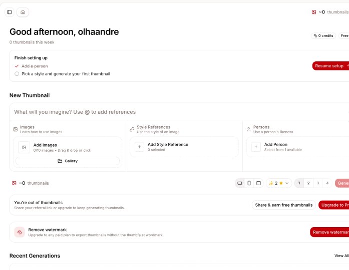
The experience shows several different states around credits and trial access: “0 credits,” “No free credits are available,” “Start my free Pro trial,” “25 free credits,” and “You’re out of thumbnails.”
Why it matters
Users may struggle to understand what they currently have available, what the trial provides, and whether they can actually generate anything right now.
Improvement
Create one consistent usage model and communicate it consistently across onboarding, Dashboard and paywalls: Available now → What it includes → What happens when it runs out → How to continue.
Business impact
Confusing entitlement states can make users hesitate to start a trial or assume the product is unavailable to them.
Executive summary
Thumbfa.st has a strong AI thumbnail creation proposition, but the current experience introduces friction across three critical moments: onboarding, first creation, and understanding product access. These issues can make the product feel more complex and less predictable before users experience its core value.
Key opportunities
- Reduce time-to-value — Remove unnecessary onboarding steps and get users to their first thumbnail faster.
- Make the first action obvious — Create a clearer Dashboard hierarchy that guides users directly toward creating their first thumbnail.
- Simplify credits & trial communication — Establish one clear model for credits, free access, and trial limits.
Want this for your own product?
This is a short, self-directed teardown of a publicly available product. We picked Thumbfa.st ourselves to review — we weren't hired to audit it, and it isn't a client of ours. A commissioned UX audit goes further: it's scoped to your product's own goals and flows, not just what's visible to an outside visitor.
Want the same kind of review for your own product? See our website UX audit page for what's included, or browse more examples to see other teardowns.